Al-Qarawiyyin for foreign tourists
dimanche 13 mai 2012
mardi 8 mai 2012
As Coelho said nothing can substitute experience. So with our team we went in old medina of Fes to experience what a normal tourist can leave during a visit. First, the general impression is that tourists are constantly being harassed by beggars, merchants, and informal guides.

Then, it
was difficult to find our way at the beginning since the Medina looks like a
big labyrinth with several paths. Hopefully, there are visual stars indicating
the direction of the touristic places. Though, I did not pay attention to them
in my first visit because they are located at the top of the walls. When asking
tourists, some of them confirmed that it was hard for them to find
Al-Qarawiyyin University and Mosque by using just the old Medina’s map.
There
are signs explaining the historical background of the mosque located in the
main doors of Al-Qarawiyyin, but they are in a very mediocre shape. It is not
attractive, yet useful, as some tourists answered just because non-Muslim
tourists cannot go in on the contrary of muslim tourists.


So Al-Qarawiyyin
is not enough visually attractive for tourists in terms of finding their way
and learning about it. However, there is a high potential of improving this
situation since the old Medina is getting renovated as a whole.
One of
the main problems for a tourist in the old Medina of Fez is getting accurate
information in an interactive way. Also, for informal guides, some of them are
offering illegal services such as accommodation and tourists are growing tired
of such practices. We should keep in mind that a tourist wants a nice
experience.


If photography
came to capture reality better than paintings did, I personally want to
recreate reality into another one when I use my camera. As an amateur of photography, my main concern
every time I take a picture is to preserve the instant with its emotion, and
translate this emotion into a conceptual idea. I will analyze my photograph
through the five criteria used in our textbook starting with describing the
picture, its elements, its context, its target and sender, and its purpose.
I. What is the picture of?
I have called this photograph “L’âme
Prisonnière” (the captive soul). I
took it with a Canon 550D using a 18-55mm lens in the old medina of Tangier. It
shows an African person standing in the middle of a crowd. We can see him begging
with the position of his hand. Indeed, he is in the foreground looking
elsewhere. In the middle ground, we can perceive the crowd giving us its back. We
principally notice two veiled women and one man within the crowd. They are very
close to each other. In the background, we have two closed windows and a big
wall with an old style architecture. In fact, shutters were typically built
during the French protectorate in Morocco. In all, the actual element is the
African beggar, and the image elements are the people and the windows in a
wall.
II. How is it built up?
First, my picture is in a vertical
rectangular format creating a dynamic movement for the viewer when zigzagging
from the bottom of the image to the top. We can say that there is almost a
perfect symmetrical composition with the beggar standing in the middle in front
of the crowd; it is creating a balance between the left and right sides of the
picture. In reality, the beggar is slightly moved to the left, and there are
two persons on the right in the middle ground while there is only one on the
left. In fact, this is an amateur picture. It does not preserve the traditional
vertical format. If I wanted the beggar to be the only important element of the
picture, I should have let a small space above him rather than showing the
windows. Also, we have an appealing direction, for we feel that everything is
happening where the beggar looks at, and also, behind him since the crowd moves
in his opposite direction. The depth of this picture is created by showing the
large element (the beggar) at the front while the rest is slightly blurred.
This builds a rhythm between people moving on the opposite direction of the
beggar. When I took this picture, I used my 18-55mm lens to zoom-in in order to
come closer to the subject. When a zoom is used in photography, the notion of
depth is automatically biased since the real proportions are not kept.
Moreover, the picture is in black
and white which generates the principal visual contrast. The light is dark, and
the enlightened part seems to be the background. At the same time, the shadows
created in the face of the beggar make him a central eye-catching element
standing against this background. Here, we simply have a front and natural
light during a rainy day. Indeed, I have taken this picture from a personal
angle as if my eyes were taking it. As a result, the picture becomes easy to
experience especially because it respects the law of proximity as well as the
law of similarity. That is, both women are veiled and close to each other; the
crowd as a whole moves into the same direction; and the windows are both in the
background on the same wall. Indeed, the angle chosen explains my willingness
to portray the reality I create through my eyes. In this mid-shot, which is focusing
on the beggar but allowing space for the windows to be noticed, I have been
cropping a part of the picture that was showing a half person walking. By
reducing the size of this picture, I just wanted to give it more consistency
toward the message I wanted to convey. Finally, the space composition is done
in a very special way mixing traditional elements of photography with
unconventional ones.
III. In what context is it shown?
We
have an internal context in the photograph. First, by being an unconventional
image, it reveals its inner life. In order words, it promises an unusual visual
experience. Also, the French architecture reflects difficult times undergone by
Morocco. Then, the Muslim community is clearly defined by the two-veiled women.
This picture is not only a window depicting reality in a natural way, but also
a mirror of my feelings. I express myself with the first person here through my
own eyes. There is no real balance between the right and left sides of the
viewer’s brain since I want to focus on emotions where the photograph can speak
for itself.
IV. Who is it aimed at? Who is the sender?
I published this picture in my
online artistic portfolio. This means that it is naturally aimed at people
already interested about visual arts in general. But it is still accessible by
everyone who gets the http address.
However, I don’t want to target anyone in particular because I believe all
forms of art should be shared; otherwise, they die. Each person has his/her own
experiences, and thus, his/her own way of seeing life. Interpretation is
totally personal which actually enriches the subject of the photograph,
painting, or any other visual. Thus, I am particularly interested in this
relationship that I can have with the audience.
V. What is the purpose?
“L’âme
Prisonnière” is an expressive image that communicates strong feelings through a
personal and poetic approach. In fact, when we go deeply into the
interpretation of this picture rather than stopping at the denotative content
described in the first part of this analysis, the image reveals its own
secrets. That is, it gives the impression to be a private image depicting
everyday life in a Moroccan old Medina, but it is much more than that. This
picture is a metaphor to poverty. All windows are closed, and the beggar is
having people’s back. He is looking elsewhere to find an emergency exit, but
there is none. He is excluded since he stands on the opposite direction of the
others. Indeed, his gaze goes elsewhere. He seems lost, but we don’t know where
he is looking at. The viewer understands that something is wrong. He perceives
this punctum where there is a strong
relationship between the actual room and adjoining room. In fact, the negative
space makes the image even stronger, for the viewer is curious about filling in
what is not shown. The message a clear: the poorest people are the less
socially integrated. It is emphasized by his skin color. That is, he left his
home country to seek for a better living situation in another society, but it
does not seem to be any better.
Furthermore, we can speak of a
synecdoche in the picture with an instrumental message by showing the part (the
French architecture of the windows) to understand the whole (the misery that
Morocco used to live in). The hard times undergone by Moroccans during the
French protectorate are indirectly compared to the despair of African beggar.
The image rhetoric is persuasive since my intention is to evoke emotions. Its
function is a reflection of the malaise created in the picture where our
capacity of empathy makes us wish for a better situation for the African
beggar. The negative metaphor picturing a dramatic storytelling is constructed
with the beggar, the crowd, and the windows. The windows are the real point of
pain since they symbolize the imprisonment. The crowd fills in the space, and
tells a small part of the story. The beggar is the focal point, and thus, he
has the main role in this story. He is l’âme
prisonnière.
Personally, I
had only few milliseconds to catch this picture in the old medina of Tangier.
It was a rainy day, and I felt melancholic. This is probably why the message is
dramatized. Again, I was not looking for picturing the perfect reality, but I
wanted to recreate the emotional instant with a direct window evoking a reality
under another reality. In other words, this picture is my reality that I
experienced under the “real” objective reality. Thus, we don’t need any outside
reinforcement, for the image speaks for itself. If I succeeded to transform the
visual image into a technical one, I wanted to go further and conceptualize it
to form a deep message. This message can is still open to several other
interpretations.
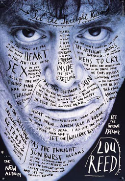
This is an album cover of Lou Reed, the singer of Velvet
underground. It is designed by Stefan Sagmeister in 1996 and it was exhibited
as a piece of art at the Design Museum of London. So it is aimed for a British
audience principally that is into indie rock music. Lou Reed wanted to do
something more personal in this album solo (“Set the Twilight Reeling”), and we
will see this on the design.
How the album cover
is built?
The first thing we perceive is the singer’s eyes. He
directly staring at us and it is both dazzling and disturbing. His eyes are on
the upper part of the picture which makes them even more a center of attention.
Then we perceive all this writing contrasting with Lou Reed’s visage. A script typography that looks messy, changing in size. Most of it is in capital letters. It’s hard to read and it generates a rhythm that guides the viewer toward a strange voyage in Lou Reed’s life. It seems that the horror vaccui further defines a claustrophobic atmosphere. However, we do have a balance in the design.
There is no depth; everything is mis-à-plat, and that reinforces the disturbing feeling.
We also have a closed design that generates a significant tension.
The designer plays with three colors: black, white, and indigo. These three colors create an important contrast that darkens Lou Reed’s face.
Purpose:
This picture is a mirror of Stefan Sagmeister’s dark personality. We have one of his pieces in our book that uses the same approach.
He wants us to travel in Lou Reed’s life. Stefan Sagmeister said that since “the lyrics are extremely personal, [he] tried to show this by writing those lyrics directly over his face” (2012). In this interview, he also states that “the human body is just one of the strongest forms there is, one that is incredibly familiar to all of us” (2012). In other words, nothing is as true as the human body exactly as those intimate lyrics for Lou Reed. Thus, using a photograph of Lou Reed becomes an essential element to remain faithful to this true side of the album.
The designer is using a simple technique in this album cover
that may appear banal: writing over a photograph. its simplicity creates its
own universe, and adds in authenticity. That is, it is an anguishing picture
with pale colors as if Lou Reed was actually appearing in the twilight that the
album is about. The lyrics match perfectly the photograph. I think it is a
great design because it is innovative. I have never seen such an album cover even
if Lou Reed and the Velvet underground in general have great album covers.
Plus, it has a real meaning. And I think the designer dared to write over Lou
Reed’s face which makes it really powerful as a whole piece of art. We cannot
deny that we are driven to read Lou Reed’s mind through his eyes, but also
through his personal lyrics.
samedi 14 avril 2012

mercredi 28 mars 2012

In this UN billboard, we notice the use of typography and color to communicate the message ("translating war into peace"). Even if the invisible typography clearly specifies the message, it is actually the last thing we read in the poster. In fact, we are first attracted by the A in red. Then, we notice the bird flying in white. The white and blue contrast makes us want to understand what surrounds the bird. Finally, we understand that it picked the A from "war" to place it in "peace".
This is an excellent combination of typography and color with a strong message behind it.
mardi 6 mars 2012

Why are visuals important for tourists when visiting a museum?
The idea of the museum has become fundamental to collecting practices beyond the museum practices that cannot only produce knowledge about objects but also configure particular ways of knowing and perceiving. Collecting practices confirm authenticity with its esteemed cultural capital because by establishing collections institutions perform the power they have in terms of practices of accessing, obtaining, transporting, preserving, and presenting esteemed objects and artifacts.
Tourists are great at collecting, as practices of both collecting and documenting (accessing, obtaining, photographing, transporting, etc.) are constitutive to the role of the tourist. By their definition as such, tourists expect and are expected to encounter exceptional sites and sights and to attempt to “preserve the moment” by employing various technologies of documentation. Being a tourist in this regard concerns being alert to aesthetic and otherwise notable sceneries and attractions, together with the willingness to and possibility of recollecting them at a later point. For tourists, pictures, videos, and souvenirs of sorts provide strong evidence of authenticity and resources for convincing storytelling and reminiscing and are part and parcel of the practices that establish the social role of the tourist and the cultural capital involved.
In the context of modern tourism it represents the production of difference: this is a scientific image and not a tourist souvenir or an emotional commemorative display. If tourists commonly position themselves inside the frame, thus authenticating their presence at the site; social scientists usually do the reverse. This is why the image conveys the larger story of bodies. It conveys the dual embodiments and available traces of the actual presence of both the visitors—who signed in the visitor book, and of the researcher—who documented their inscriptions and in order to do so had followed their path and journeyed to the site.
In our projects: Providing visuals such as a virtual tour on DVDs or replacing the book signing with digital storytelling videos will satisfy this need of collecting souvenirs.
Noy, C. (2011). The Aesthetics of Qualitative Research Performing Ethnography at a Hetitage Museum. Qualitative Inquiry. Vol 17 no. 10, 917-929
Inscription à :
Articles (Atom)